
Outbound Design
The brand identity behind my own studio: logo system, color palette, and style guide built for sports and outdoor recreation work.
Outbound Design needed to look like a real studio, not a side project, but a brand identity that could carry logo, color, and type across proposals, social, and future client work, built to fit the sports and outdoor recreation space it serves.
A full identity system
Logo system
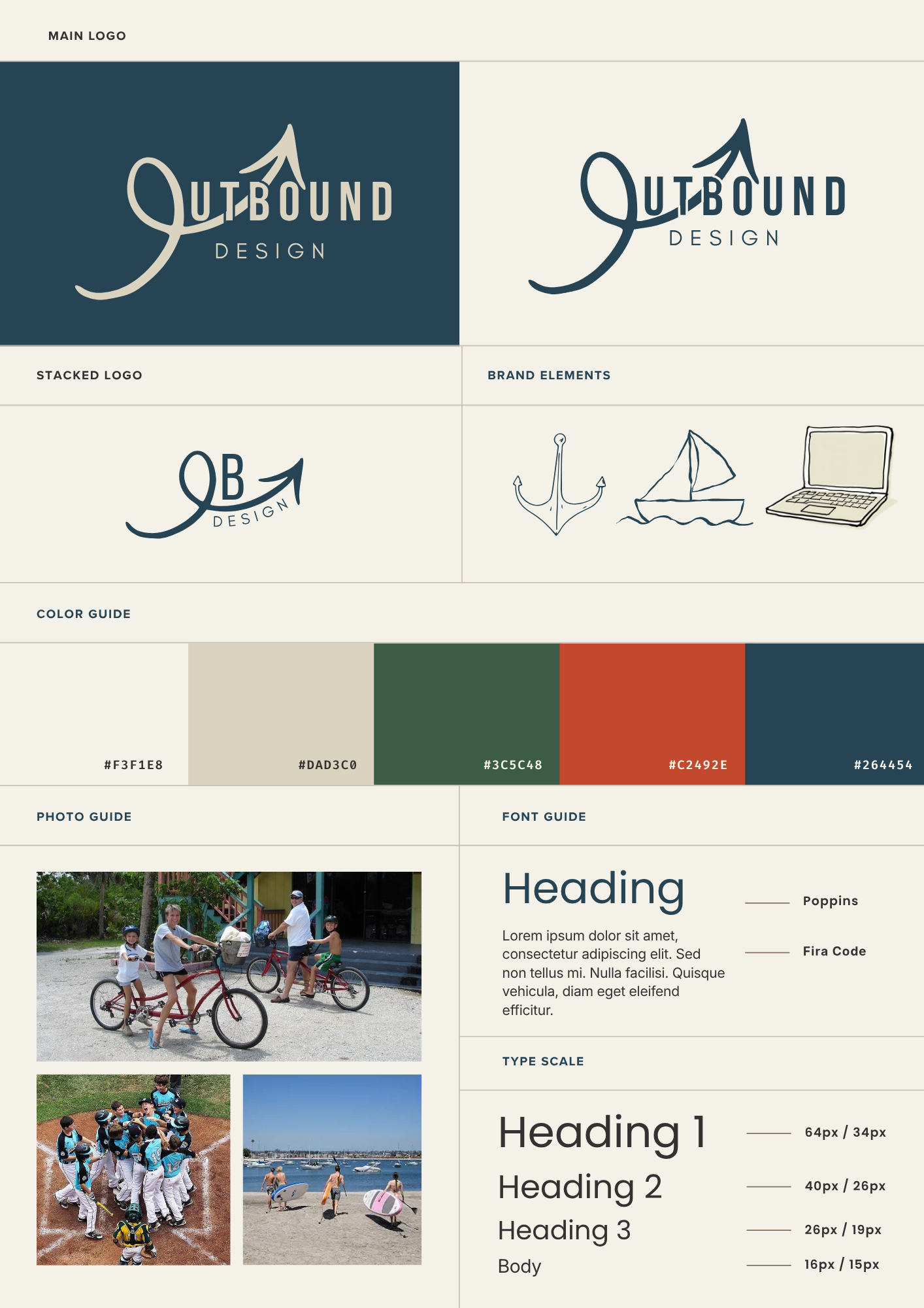
A primary wordmark built around a custom cursive "O" and an arrow-peak motif, plus a compact stacked "OB" mark for smaller placements.
Color palette
A five-color system of warm neutrals, forest green, rust red, and deep navy, built to feel outdoors-inspired without going literal.
Typography
Poppins for headings and Fira Code for body copy, with a defined type scale from H1 down through body text.
Brand elements
A set of hand-drawn line icons (anchor, sailboat, laptop) for use across the brand's collateral.
Photo direction
Guidance for on-brand photography, favoring real, lived-in outdoor and sports moments over stock imagery.
Warm neutrals, outdoors-inspired
A restrained palette and a type system built to hold up across a logo, a proposal deck, and a client site alike.
Looking back
- Designing the logo and the stacked mark together kept both versions consistent at every size
- Building the palette around the studio's own niche kept it from feeling like a generic outdoor brand
- Documenting type scale and spacing up front made every later asset faster to produce
- Design a few real applications (social templates, a proposal cover) alongside the guide itself
- Test the stacked mark at favicon size earlier in the process
- Expand the photo guide with more real client shoots as they come in
Outbound Design now has a real identity system behind it: one place to point every future client, proposal, and post back to, instead of rebuilding the look from scratch each time.